wingin’ it
fall 2019
branding, interaction, exhibtion
︎︎︎ created with Anne McDonald & Sarah Colby
︎︎︎ created with Anne McDonald & Sarah Colby
doing the hard work for you.
Current event planning involves sifting through multiple interfaces, heated arguments, and endless planning. This usually results in staying at home, or continuing the same routine. Wingin’ It is intended to get people out of their comfort zone by bringing the adventure to them. Wingin’ It is an application that generates a day of adventure based on preferences, location, and budget. Through machine learning, and by partnering with other companies such as Uber and Venmo, the app does the hard work for you.
Current event planning involves sifting through multiple interfaces, heated arguments, and endless planning. This usually results in staying at home, or continuing the same routine. Wingin’ It is intended to get people out of their comfort zone by bringing the adventure to them. Wingin’ It is an application that generates a day of adventure based on preferences, location, and budget. Through machine learning, and by partnering with other companies such as Uber and Venmo, the app does the hard work for you.
how it works.
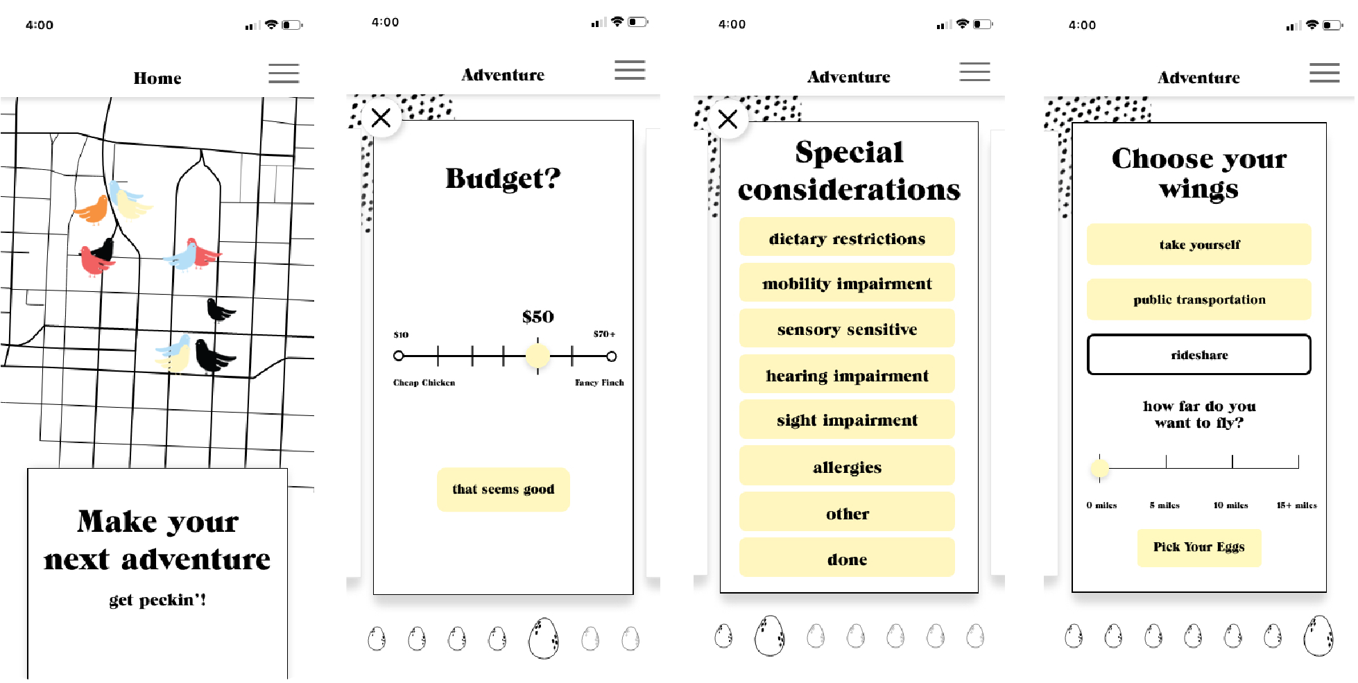
Users create their profile either through an existing email or through their Facebook Google account. in order to make each experience unique to what is in the area, we also will be working with local businesses in each area that our application is available. To create their customized event, users take a brief survey to give parameters for what they wish to do that evening, focusing on budget, location, transportation, amount of people, users’ mood that day, and if they want to eat on their adventure. We have utilized language that in inherently vague so that users are able to play in the idea of not knowing what they exactly are going to be doing. Because we want everyone to be able to wing it, we took a special interest in special considerations that would need to be made, such as mobility impairments or food allergies.
branding.
The phrase “winging it” comes with many
preformed associations. One might use the phrase when attempting something they aren’t familiar with or didn’t prepare to do. “Wing” alone can mean a limb on a bird, a snack paired with football, or what you see of out a window of an airplane. We wanted to embody all of these ideas into a cohesive yet playful identity.
![]()
The phrase “winging it” comes with many
preformed associations. One might use the phrase when attempting something they aren’t familiar with or didn’t prepare to do. “Wing” alone can mean a limb on a bird, a snack paired with football, or what you see of out a window of an airplane. We wanted to embody all of these ideas into a cohesive yet playful identity.
motif
Going along with our playful emphasis, we created a motif to be used within our platform. The basis of the design is textures and patterns found on various bird breeds.
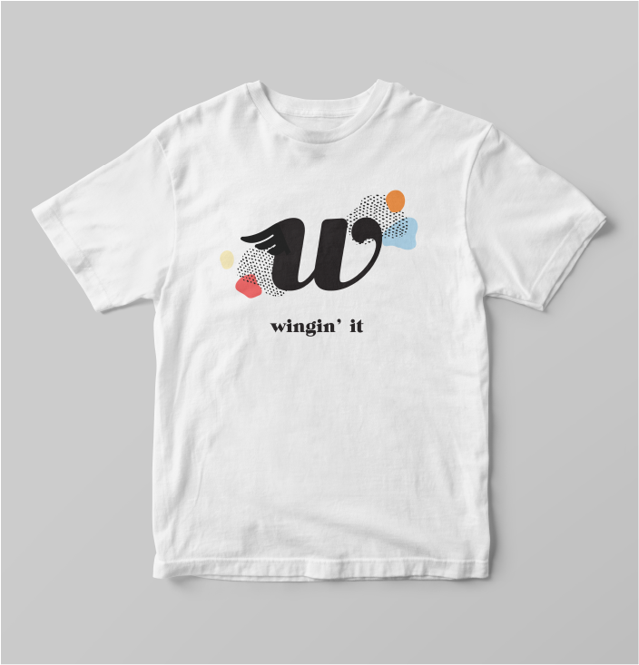
logo
We wanted our logo to be as fluid and whimsical as the idea of just going with the flow. Inspired by bird wings, we have adapted the form of the W to have a wing—playing off the idea of flying by the seat of your pants.
typefaces
ITC Grouch is a bold serif typeface that we selected for our headers. This font gives a contrast in structure compared to our flowing logo and art motif. Avenir medium is used through out our website and application as a body and subheader typeface.
color
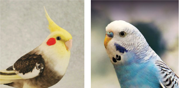
We took inspiration from birds with vibrant colors such as the parakeet and cockatiel that are pictured to the right. Both birds are deemed to be some of the most playful breeds of birds and we believe they fit right into our brand.
Going along with our playful emphasis, we created a motif to be used within our platform. The basis of the design is textures and patterns found on various bird breeds.
logo
We wanted our logo to be as fluid and whimsical as the idea of just going with the flow. Inspired by bird wings, we have adapted the form of the W to have a wing—playing off the idea of flying by the seat of your pants.
typefaces
ITC Grouch is a bold serif typeface that we selected for our headers. This font gives a contrast in structure compared to our flowing logo and art motif. Avenir medium is used through out our website and application as a body and subheader typeface.
color
We took inspiration from birds with vibrant colors such as the parakeet and cockatiel that are pictured to the right. Both birds are deemed to be some of the most playful breeds of birds and we believe they fit right into our brand.
another form of interaction.
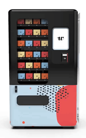
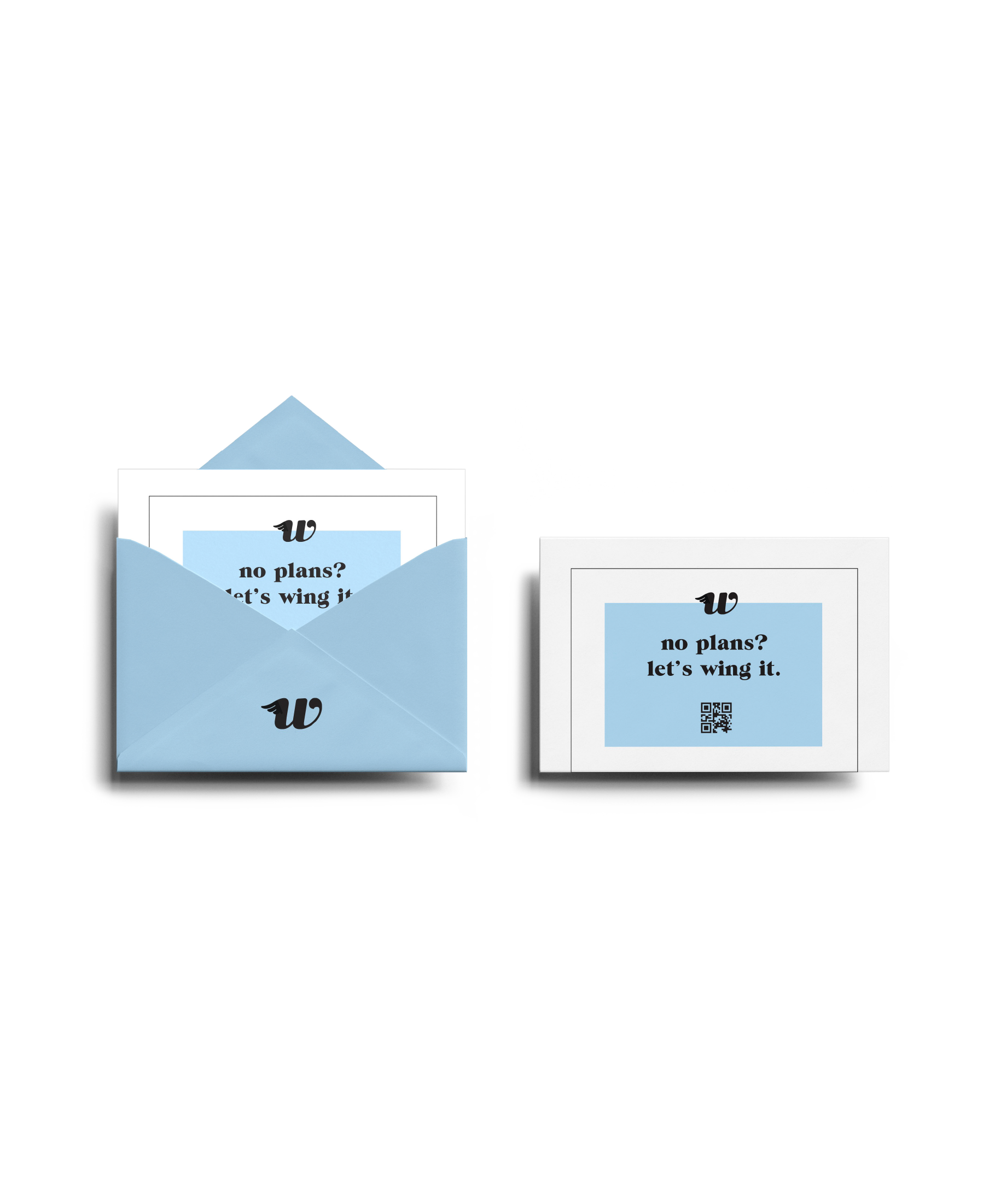
In addition to the application, we decided to add a physical element into our system. The Wingin’ It vending machines are intended to be placed strategically throughout the city, near coffee shops or bars. To use one of our vending machines, one simply walks and up and pays a price of $1 for an envelope. Inside the envelope is a code you can input into the app. After entering the code, wingin’ it shows you a random itinerary from the envelope you selected in the vending machine. You can choose if you would like to go on it the random trip, or explore the app for a more personal itinerary. Each vending machine also includes one envelope that holds a code that would give one lucky user an all expenses paid adventure!
In addition to the application, we decided to add a physical element into our system. The Wingin’ It vending machines are intended to be placed strategically throughout the city, near coffee shops or bars. To use one of our vending machines, one simply walks and up and pays a price of $1 for an envelope. Inside the envelope is a code you can input into the app. After entering the code, wingin’ it shows you a random itinerary from the envelope you selected in the vending machine. You can choose if you would like to go on it the random trip, or explore the app for a more personal itinerary. Each vending machine also includes one envelope that holds a code that would give one lucky user an all expenses paid adventure!
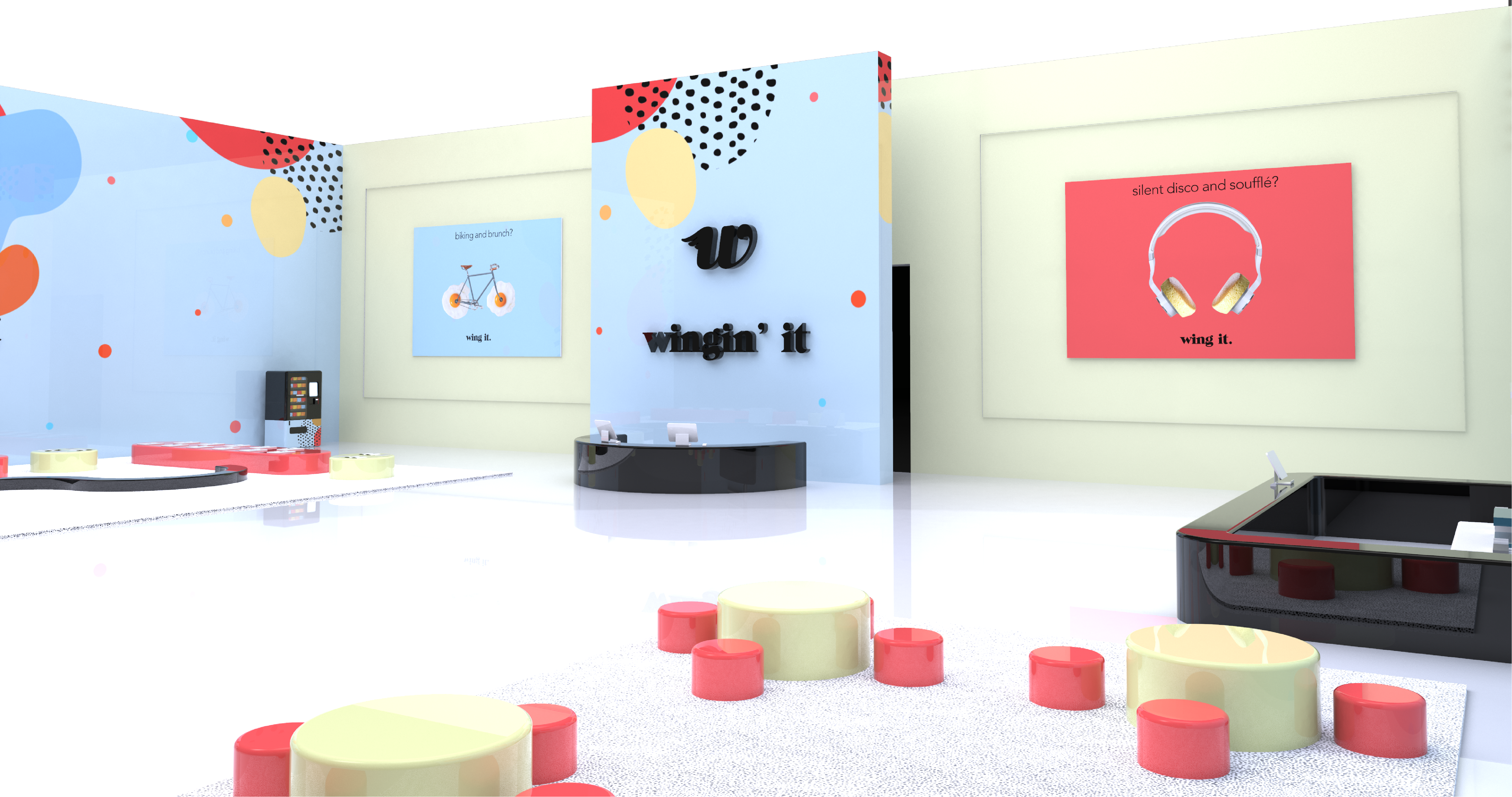
exhibition space.
For our exhibition space, we were inspired by the teamLab borderless in Digital Art Museum created by art collective teamLab in Tokyo, Japan. Their concept includes “Artworks move out of rooms, communicate with other works, influence, and sometimes intermingle with each other with no boundaries.” This inspired the idea of how our exhibition can interact with the user. We wanted the exhibition space to be an abstract concept of our overall platform is as well as the most spontaneous touch point. When you walk into the exhibition, inside the space is covered with moving abstract videos. Depending on what you touch and sync with your device as well as machine learning, the exhibition space will decide on a space for you. For example, depending on what the color, speed, and movement of a particular video you choose can completely change what your final experience will be. Currently, the experience that is curated will be within walking distance of the pop-up shop to drive more incentive to go on your adventure. Once you have left the exhibition space, outside is a merch section and a hang out bar with bird themed beverages and snacks.
For our exhibition space, we were inspired by the teamLab borderless in Digital Art Museum created by art collective teamLab in Tokyo, Japan. Their concept includes “Artworks move out of rooms, communicate with other works, influence, and sometimes intermingle with each other with no boundaries.” This inspired the idea of how our exhibition can interact with the user. We wanted the exhibition space to be an abstract concept of our overall platform is as well as the most spontaneous touch point. When you walk into the exhibition, inside the space is covered with moving abstract videos. Depending on what you touch and sync with your device as well as machine learning, the exhibition space will decide on a space for you. For example, depending on what the color, speed, and movement of a particular video you choose can completely change what your final experience will be. Currently, the experience that is curated will be within walking distance of the pop-up shop to drive more incentive to go on your adventure. Once you have left the exhibition space, outside is a merch section and a hang out bar with bird themed beverages and snacks.